
In late October, as Europe experienced a relentless second wave of COVID-19 infections, nations responded with several versions of a partial or full lockdown. Unlike the first wave in March, European nations diverged in the severity of their reactions – from a full lockdown in the Czech Republic to a much more relaxed ‘partial lockdown’ in Germany. Within a few weeks it became apparent that these difference in policy also had different results: While most European nations reached a peak in the weekly incidence rate and than saw a significant decline, some – most notably Germany – only managed to reach a plateau, with new infections remaining on the same level, give or take, testifying to a reproduction rate of just about 1. This steady states lasted for almost a month, before infections suddenly picked up again in early December , prompting a relatively strict lockdown in Germany from the 16th.
While Germany was in this steady state, I expected Germany to remain at about the same cPDI (composite Pandemic Danger Index). This, however, was not the case: starting from mid-November, Germany’s cPDI rose steadily, climbing from a not-so-bad 50 on Nov 20th to the mid-60s in early December and up to an alarming 75 (on the verge of our top ten!) on Dec 19th. This result surprised, so I decided to dig a little deeper.
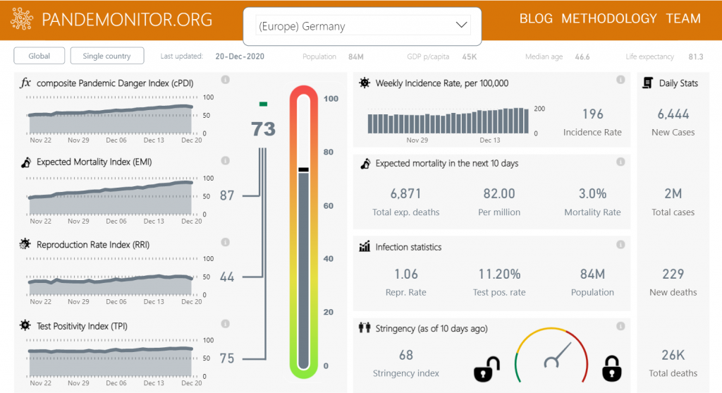
Looking at the dashboard for Germany, it became clear that the steady rise in cPDI was due almost entirely to the ever-rising value of one specific component, the Expected Mortality Index (EMI), which rose from 45 on Nov 20th to 68 on Dec 4th and up to 88 on Dec 19th. This still seemed odd, because our model calculates expected mortality by multiplying the incidence rate by the mortality rate, so steady incidence should result in a steady expected mortality prediction. Unless – and that’s exactly what happened in Germany – the mortality rate changes.
In early December, when I first noticed this trend, I attributed it to an actual rise in mortality rates – resulting from the rise of the median age of COVID-19 patients in Germany as it became harder to protect the elderly. Thus, I discounted the rise of the cPDI as an ‘effect’ and thought it was an over-estimate of actual mortality (it turned out to actually be an under-estimate, as mortality in Germany exploded in the following weeks). Thus, while the ‘rising patient age’ explanation is probably at least partly true – data from Germany’s Robert Koch Institute shows the median age of patients rising from around 40 in late October to 46 in December [1] – it might not be the only cause of rising mortality rates.
You see, our mortality rate calculation is an estimate of the Case Fatality Rate (CFR), which is roughly the percentage of deaths from among the reported cases. This means that if less cases get detected and reported, the CFR rises; in fact, this is one of the reasons we use this measure – it allows us to uncover and take account of ‘hidden infections’ that are missed because asymptomatic or mildly-symptomatic patients are not being tested enough. Thus, a possible explanation of the data from Germany is that the rate of new infection actually did keep growing, at a very low rate (i. e. R just above one), but it was obscured by lack of adequate testing. If this is in fact the case, it shows that the Pandemonitor model was actually smarter than me – while I kept calm because if the steady incidence levels and discounted the mortality rate as an outlier, the model sounded the alarm bells to foretell of danger ahead. – and it was right.